
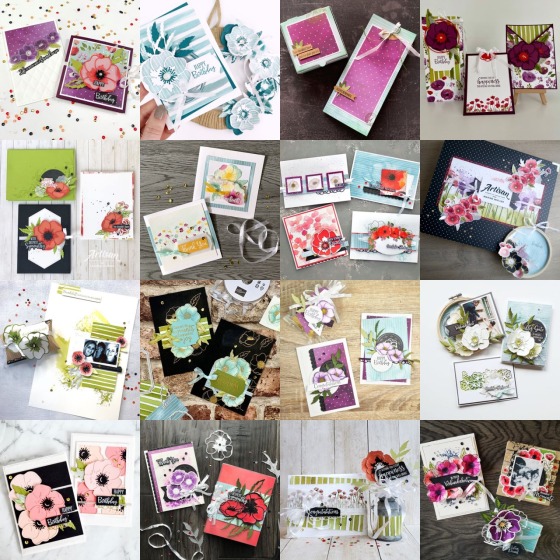
Welcome to the February monthly blog hop with the 2020 Artisan Design Team. For those of you that are new to my blog, I am Leah from Edmonton, Alberta, Canada.
![]()
We are currently in the middle of winter which gives me lots of reasons to stay warm in my craft room and create projects that I hope will inspire you! This month we are showcasing colourful florals with the Peaceful Poppies Suite.
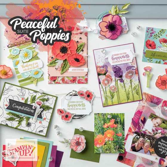
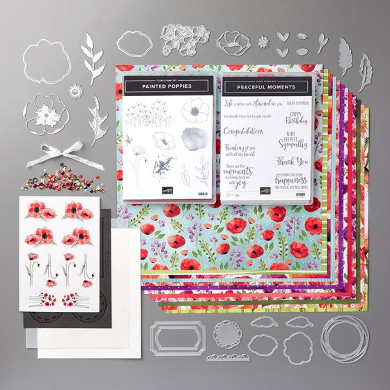
For my projects I decided to highlight the accent colours in this suite – Pool Party, Crushed Curry, and Blackberry Bliss. I also took inspiration from the Painted Poppies stamp set and the coordinating Peaceful Poppies Designer Series Paper (DSP) and added my own touch of watercolour.
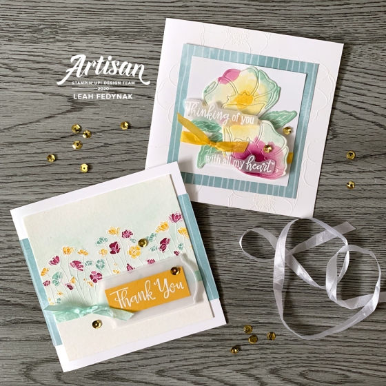
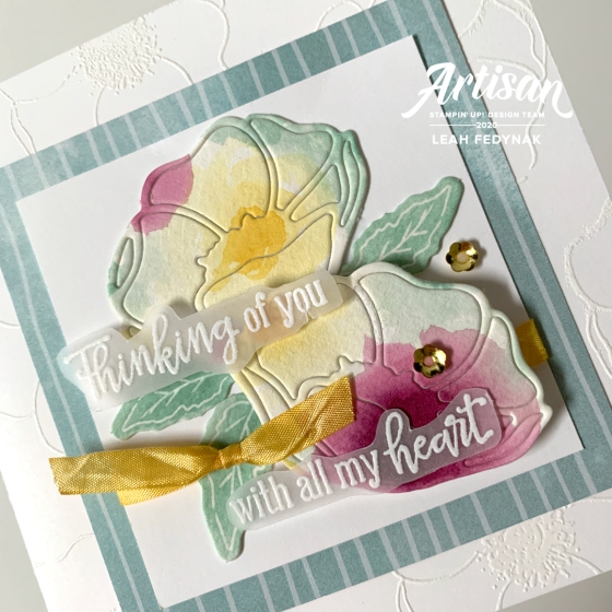
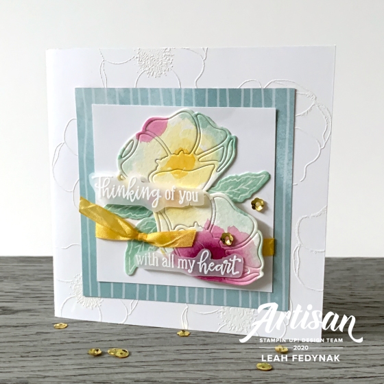
I created the top card by starting with a watercolored background. Random drops of colour (Pool Party, Crushed Curry, and Blackberry Bliss) were painted on the Fluid 100 Watercolor Paper and allowed to dry. Then two flowers were cut from the paper using the Poppy Moments Dies .
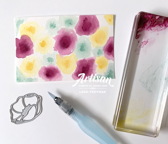
I used the whole flower once it was cut out, the outline and the inner pieces. Tip: Assemble all the pieces of the flower upside down and run the SNAIL Adhesive over all of the back. The adhesive will help keep the flower together as it’s put on the layout.
The card base was embossed in white with the poppy stamp from Painted Poppies and a layer of Peaceful Poppies DSP was put on top. This was followed by another square of Whisper White and then the die cut watercolour poppies. The sentiment is from the Peaceful Moments stamp set and was embossed in white on vellum.
The accent leaves were white thick cardstock die cuts from the Peaceful Poppies Elements and they were blended with Pool Party and a sponge dauber. Finally, the Crinkled Seam Binding Ribbon was coloured yellow with the Light Crushed Curry Stampin’ Blend and added to the card along with a few cute, gold flower sequins.
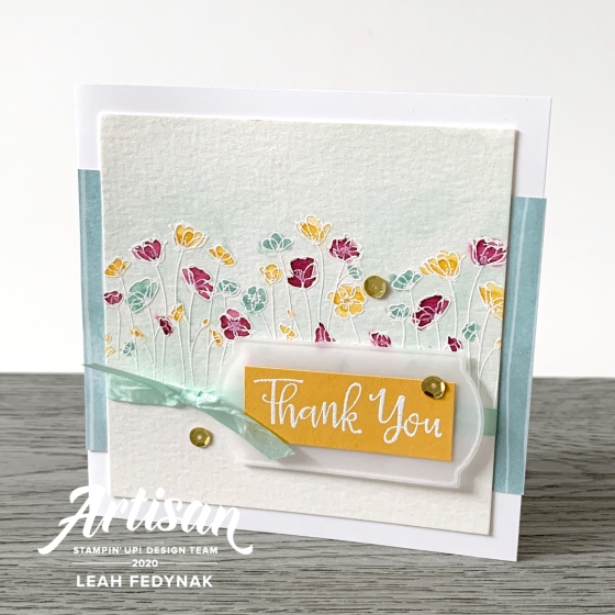
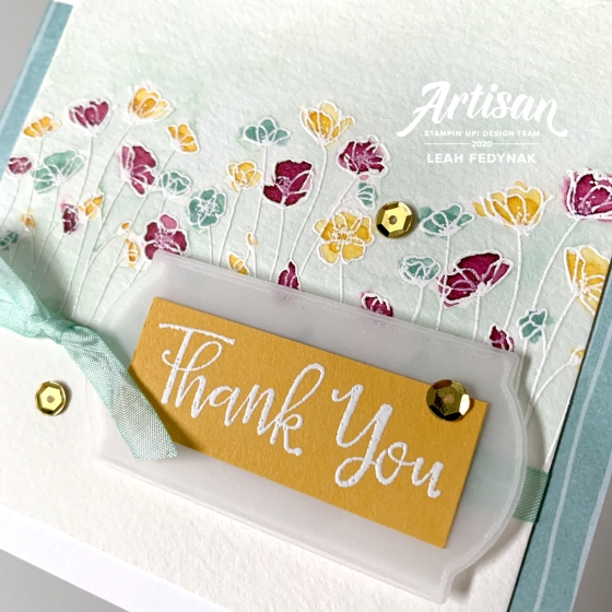
The second card features a field of colourful poppies watercoloured in the same three colours as above, but with the flowers embossed in white on the watercolour paper. A soft wash of Pool Party was created on the background so the little flowers would stand out more. This was layered on Whisper White cardstock with the same DSP as the previous card.
The sentiment was white embossed on Crushed Curry and layered with vellum cut from the Painted Labels Dies. This time the Crinkled Seam Binding Ribbon was coloured with the Dark Pool Party Stampin’ Blend and accented with the gold sequins.
This suite offers so much variety that it is a must have for any crafter! I hope you found a little inspiration with my projects and for more ideas, hop on over to Manuela’s blog to see the fantastic projects she created!
Leah

Stampin’ Up! Supplies Used For This Project
All supplies used in this project can be purchased from my Stampin’ Up! Store.
PAPER: Whisper White, Crushed Curry, Vellum, Fluid 100 Watercolour Paper, Peaceful Poppies DSP
STAMPS: Painted Poppies, Peaceful Moments
INK: Pool Party, Crushed Curry, Blackberry Bliss, Versamark
PUNCHES & DIES: Poppy Moments Die, Painted Labels Die
TOOLS: Aqua Painter, Sponge Dauber, White Embossing Powder, Stampin’ Blends
EMBELLISHMENTS & RIBBON: Whisper White 1/4″ Crinkled Seam Binding Ribbon, Peaceful Poppies Sequins
OTHER: Peaceful Poppies Elements
2020 Stampin’ Up! Artisan Design Team

Follow Birdwing Paper Designs on Instagram @ellefedynak, Facebook at Birdwing Paper Designs, and Pinterest at Birdwing Paper.


Pingback: February 2020 Artisan Blog Hop - Peaceful Poppies Suite | Stampin' Hoot
Pingback: Artisan Design Team – Peaceful Poppies Suite Blog Hop
Pingback: Stampin' Up! Artisan Design Team Blog Hop - Peaceful Poppies - Coastal Crafter
Genius idea watercoloring and putting the pieces back togeter.
Also like the white on white embossing a lot. I need to give that a try some time.
LikeLike
Originally I wasn’t going to put the pieces together in the die cut poppies, but when I saw how much watercolouring was going to be lost to the recycle bin, I had to keep it all together!
LikeLike
These are gorgeous Leah! Love the idea of making your own patterned paper and then using that for your die cuts! Just stunning! Rochelle xo
LikeLike
Thanks so much, Rochelle!
LikeLike
I just love the second card creation! I think its your choice of color that drew me in. It’s one of my favorites of the Artisan designed cards. The dainty little flowers embossed in white softens the look of the card. I just love the watercolored wash in Pool Party behind the blooms, you’re right it just highlights those little gems. The sentiment on crushed curry was a great use of color, just tied the whole project together. I’ve used all the stamps in this set but the little row of blooms, you’ve inspired me to get it out and give it a little love! It would make the perfect spring card to go with a set I’m creating for Easter. Thanks for the inspiration!
LikeLike
Thank you so much for the kind words!! It’s funny that you mention how the choice of colour drew you in because the first card I made had different colours. My husband wasn’t a fan of the colour choice so I changed it to what you see now!! It works so much better! (I will be posting that first card on Instagram @ellefedynak next week.) I am so glad I inspired you to use this stamp – sometimes it just takes a fresh perspective to spark creativity!
LikeLike
Stunning and beautiful, Leah! It’s ironic how my husband also offers some great advice when I’m in the process of creating my cards. I definitely value his opinion and often “tweek” a card after hearing what he has to say❤️
LikeLike
It’s really stunning Leah ! I love your tips with aquapainter ! Thanks for sharing !
LikeLike
Thanks, Marine!!
LikeLike
Absolutely beautiful Leah. Thanks for that great tip.
The colour combination is gorgeous.
LikeLiked by 1 person
your cards are such a soft inspiration to me, I really do love them a lot.. thanks for sharing!
LikeLiked by 1 person
Thank you, Manuela!
LikeLike
Oh wow, wonderful, love the colors!
LikeLike
Thank you so much!!
LikeLiked by 1 person
What beautiful projects – I love the soft watercolour & the colour choices are beautiful!
LikeLike
Leah you already know much much I adore these projects!
LikeLike
Leah, these are beautiful. I love the way you’ve softened down the brightness of the colours by choosing the accent colours and then using watercolour. The consistent use of vellum also softens them. The white embossed background in the first card is such a perfect detail to add. I already loved the row of poppies stamp but the way you’ve used them in your second card makes me love them more.
LikeLike