In the previous post, How to Recolour a Chipboard Alphabet, I showed how to add colour to plain chipboard and blend the colour so the texture of the chipboard showed through. In this tutorial, I will show you how to go a step further and add pattern or distressing to the chipboard using Photoshop (PS).
The previous tutorial also explains how to move the letters from the .png file (found in the Fall Edition of Hello 2014 digital kit) to a New or Open file, so refer to that first if needed.
Adding a Pattern to Chipboard:
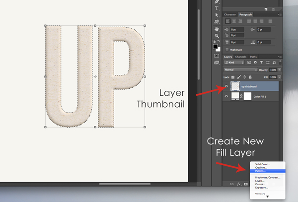
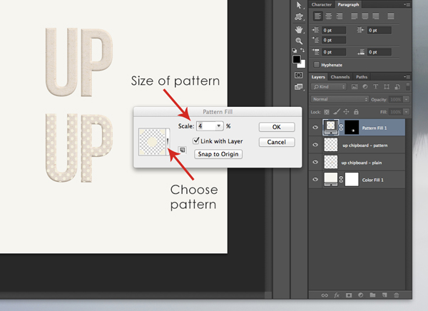
The first step is to select the letters (CMD/CTRL + Layer Thumbnail) which results in marching ants around the edges of the letters. At the bottom of the layers panel select Create New Fill Layer (half-filled circle icon) and choose Pattern from the drop down menu.

The Pattern Fill menu will appear. Select the type of pattern and scale/size. Click OK and the pattern will appear only on the letters chosen. If you need to change the type or size of pattern, the menu can always be accessed by double clicking on the Pattern Fill Layer Thumbnail.

To blend the pattern, choose a blending option from the top of the layers panel. For chipboard, the Multiply blend works well and lets the texture of the chipboard show through. But sometimes, experimenting with the blending options can result in great,unexpected effects, so try to play around with it.

The end result is chipboard with a bit more character that can be customized to any layout.
Distressing Chipboard:
I first learned this technique in Tiffany Tillman’s “Title Express” class at Scrapaneers and I wanted to share it because I use this effect all of the time on various chipboard letters and shapes.
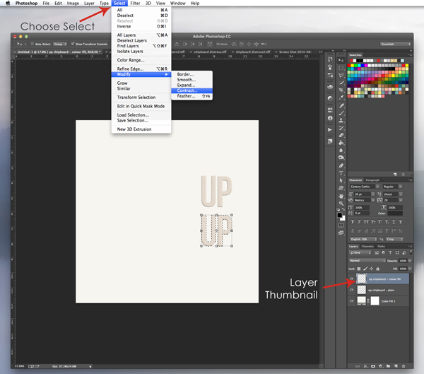
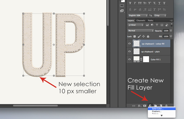
To distress the chipboard, we begin by selecting the letters as usual (CMD/CTRL + Layer Thumbnail), but when adding colour, we want to pull it away from the edges of the letters a bit. To do that go to Select > Modify > Contract, and from the menu that appears select “Contract By 10 Pixels” > OK.

As seen below, the new selection has pulled away from the edge of the letters by 10 pixels. Now add some colour: Create New Fill Layer > Solid Color > Choose colour.

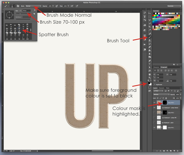
And, once again, change the blending option from Normal to Multiply.

Now comes the tricky part… distressing! We want the chipboard to look like it was sanded on the edges. Click on the Color Mask (the black box linked with the Color Fill layer) and make sure it is highlighted. Then make sure the Foreground Colour is set to black. Select the Brush Tool, choose a spatter-like brush from the menu, and change the size to 70-100 px. Also, ensure the Brush Mode is normal. Then start clicking with the spatter brush around the edges of the colour to give a distressed or sanded look.

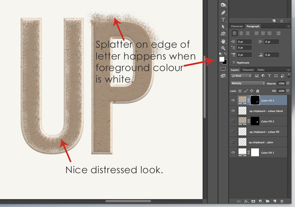
If nothing happens when using the brush, double check that the Colour Mask is highlighted, not the Colour Fill Layer Thumbnail. Or if the spatter shows up outside the letter, make sure the foreground colour is set to black and not white. I only mention these two tips because I made both of these mistakes when I first learned how to distress chipboard!!

Distressing a letter takes a bit of time and patience but is well worth it in the end!
Here is a layout I created using patterned and distressed chipboard: (Digital kits “One For The Album” and “Scenes From Real Life” by One Little Bird Designs.)

The first part of the chipboard title “LOOK UP” has been recoloured and a subtle polka dot pattern added over top. There was already a lot of patterns on this layout and I didn’t want the pattern of the chipboard to clash. I also clipped and blended an arrow shape to the word “UP”. The second part of the title “WAY UP” was simply distressed for some added texture to the page.
I hope, after this two-part tutorial, you are inspired to play around with the chipboard alphabet.
Reminder: The chipboard alphabet is available free for a limited time (until Sept. 30, 2014) as part of the Fall Edition of the Hello 2014 digital kit. Visit Birdwing Paper Designs Facebook Page and click “Like” to get this free kit.
Leah